Monday, December 18, 2017

Web Project

What I did

I made a website for me....sort of. The website isn't going to actually be posted for everyone to see. The site will only be screen shots of it from blogger. Making the website was not that hard, just took awhile that's all. 

How I feel about it

I think that I didn't do too bad, but I did have issues here and there. I'm glad that it's not going to be for everyone to see. 

How I want to use it in the future

I'm going to use YouTube for my own time and make animations for my videos. I'll also be posting my videos on my official website (only when I have a lot of subs). If I am going to use it for an actual job, it'll be used similarly but will depend on quite a bit of things, like the job itself. 


Thursday, December 14, 2017

ElevatorPitch

My ElevatorPitch


I am from Olathe Northwest High School and I’m currently taking an e9 class which teaches me how to edit videos, make art, and animate.

As me main interest is animation, I want that to be a part of my job. I’ve been practicing since I was in 8th grade. If I’m going to use that skill for fun, I’m going to do animations for YouTube.

I might do both 2d and 3d animation, it will depend on how good I am at both. I’ve done more with 3d animation, but altogether I should me able to get better.

I will continue to practice on all and will try to take a class like this when I move up a grade. This class is actually this only reason why I’m in this school right now.


My least favorite may be graphic design, but it is still a part of this class I like. I would say that so far video is my favorite but that might change when I get to the animation part.

Typography

My Typography


Friday, December 8, 2017

Berik's Logos

All Logos


  1. I was planning on a logo that was more of a YouTube thing but I ended up removing that idea all together. 
  2. The logos was made with the shapes of mostly circles, squares, and a few stars. 
  3. Making the shape itself was finished, but after that, I added different colors to see what will be fitting for my logo. 
  4. I made four logos digitally, and over ten logos and paper. 
  5. Shape and Color are very important when making a logo because they can both describe what the logo is for. 
  6. Logos can also be very fun to make, unless you are making a logo for someone's company and you are not giving any credit for your hard work. 

Final Product


  1. The final product I used was very good in my opinion. 
  2. The colors I used are orange, black, and a shade of white. 
  3. The final shapes were square, circle, and stars. I
  4.  thought that the colors weren't going to look good together but I prove myself wrong on that one.
  5. I wouldn't say that my logo is the best, but I wouldn't say it is the worst as well.


Monday, December 4, 2017

10 Strengths of Berik


  1. I am very creative on making stuff like art.
  2. I can figure out most struggles on my own.
  3. I practice quite often when to comes to most stuff.
  4. I don't give up easily.
  5. When motivation kicks in, the job will be either done fast, done well, or both
  6. I work hard most of the time.
  7. I may not look like it but, I'm normally in a good mood.
  8. Good at working on stuff like computers.
  9. Know a lot about video games.
  10. Nothing to me is too hard when I'm in a good mood

Monday, November 20, 2017

Logo Color Scheme


analogous


This logo uses the analogous colors of red orange. I think the Company probably chose this color because it looks good together

complementary


This logo uses the complementary colors of blue and orange. I think the Company probably chose this color for a fitting design.


warm


This logo uses the warm colors of yellow and orange yellow. I think the Company probably chose this color because of it matching the product's color


cool

This logo uses the cool colors of green and violet. I think the Company probably chose this color because of the two fitting well together


monochromatic 

This logo uses the monochromatic colors of yellow. I think the Company probably chose this color to match with the red it also has in some of it's other logos


triad

This logo uses the triad colors of red, blue, and yellow. I think the Company probably chose this color  because when making a logo, this was the best results


Friday, November 17, 2017

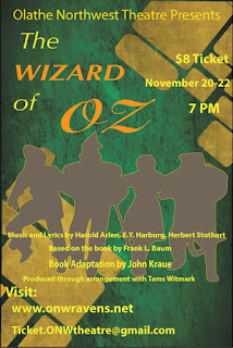
OZ Poster

Contrast:


  • made words like OZ seem more important
  • all big words and also words with special fonts are used for attention
  • smaller words are less important but are still able to read them

Alignment:

  • the image in the poster was centered for it to fit better
  • title and website had left alignment because better than other alignments
  • right alignment was not used a lot while making the poster

Repetition:

  • colors was around the same to fit with background
  • used bolded letters for all that was important
  • italic was used with bold for more important words

Proximity:

  • all words that were fitting with each other like the words in the title were more grouped up
  • the words wasn't too close to each other otherwise, it will be harder to read
  • spaced out the words and put in another part of the poster to give better understanding when reading


Friday, November 10, 2017

Color Wheel

what was the project?

We were working on a color wheel as the project. The color wheel had the primary colors, secondary colors, and tertiary colors. We used Illustrator to make the wheel. Most of us were finish on time, but some like me, were finish late.

what did I learn?

Things I've learned on Illustrator is that it is important even though it does not seem so. Another thing will be that you have to be creative about the things you make. I'm already creative so I'm good on that part. Not everything has to be perfect, but at he same time, make it look good.


How did I do?

I feel like a did alright for a first time. Of course there is always a way I can get better. I should try to be faster on it but at the same time, don't rush it. I do feel like I can use this in my future for a job. once I'm good at video, graphic design, and animation, I'll be creating great things for others to enjoy watching.


Thursday, October 12, 2017

AB Sequence by Break and Nathan

About:
showing point At o B

What my partner and I did:
showing point A to point B but with memes

The final project:
I say it's pretty good

how to print a doc.

1. taking pics

my team and i took our pics first just to get an idea of what we're doing.


2. filming

after we took the pics, me and my team made a filmed version of what we made


3. video editing

the video editing was done by ourselves not working together, to be honest, I might has not done as good as the others but I have not seen them yet.

Tuesday, August 29, 2017

Side Walk Chalk

Part 1. getting grouped up

I wasn't a fan of being in groups at the moment, but with my team members, is wasn't that bad. There was four of us working on a project that tells about all of us, it was an drawing on chalk. 

Part 2. the ideas

We had great ideas, my idea for my part was a bow and arrow because the bow is me and the arrows is my ideas I don't want to run out. the other three had an anchor, penguin-corn (don't ask), and a hockey stick.

Part 3. using the chalk

When we got to use the chalk our final thing was a penguin-corn with a bow and arrow on one flipper and a hockey stick one the other. We use the anchor as a tattoo.